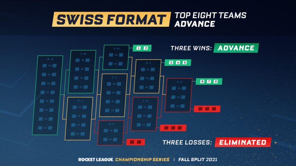
How to Explain a New Tournament Format
How do you explain a new competition format with almost no text? Rocket League Championship Series found a way, and it's borderline genius.

I'm a Rocket League wannabe, and I've started getting into the Rocket League Champion Series ("RLCS") in recent months. When they started using a "Swiss" layout, I had no idea what the format was.
Round-robin is easy: everyone plays everyone.
Single-elimination? NCAA Men's Basketball has made it a staple every March. It's gaudy and uninspiring, but it's simple: winners move on, losers watch on TV like the rest of us.

But a Swiss format? That just sounds complicated.
Until I saw this graphic.

I've had this screenshot on my desktop for over a week, and I feel like I learn something new every time I deconstruct it. Whoever designed it communicated so much with almost no text.
Color
Rocket League is an international esport, and the use of green-yellow-red appeals to a global familiarity with that progression of color. In this graphic, green means you're undefeated, red means you're on the verge of elimination, and yellow means you're somewhere in the middle. Notice how the color isn't just the border of the "boxes" but also the lines connecting the boxes.
Progression
The lines showing progression between rounds is pretty standard (see NCAA bracket above). I like how this designer angled the rounds and the games themselves to subtly imply progression.
Status
One of the benefits of a Swiss format is that many games tend to be close because the two teams playing always have the same record.
At the top of each group of games, you can see the record (e.g. "1-2") of the teams competing. One of the few uses of text, but appropriate. In this scenario I think it would be more confusing to replace the records with symbols or something else.
Shortcomings
The records above each "box" are hard to read, and the graphic doesn't explain how teams are paired in the first round when they're all 0-0. It also does not
Do the shortcomings matter?
Given the clean design, minimal use of text, and excellent layout that carefully takes on the difficult job of explaining a new competition format in a 1920 x 1080 frame, this a slam dunk of a design. Kudos!