Breakdown: FOX's Controversial Super Bowl Score Bug
Why FOX's ultra-minimalist score bug came up a yard short
In keeping with Super Bowl tradition, FOX released their new NFL graphics package.
They were immediately met with INSANE backlash over their score bug.
Most posts only echo the collective anger, but why doesn't this work?
Let's dive in.
The debut of our new score bug pic.twitter.com/XqTlS6MiXN
— FOX Sports: NFL (@NFLonFOX) February 9, 2025
Clearly the goal was to not just go with a minimalist design, but an ultra-minimalist design. I'm guessing the intent is to maintain the viewer's focus on the game by removing traditional graphical elements.
This ultra-minimalism especially stands out compared to FOX's past Super Bowl score bugs.
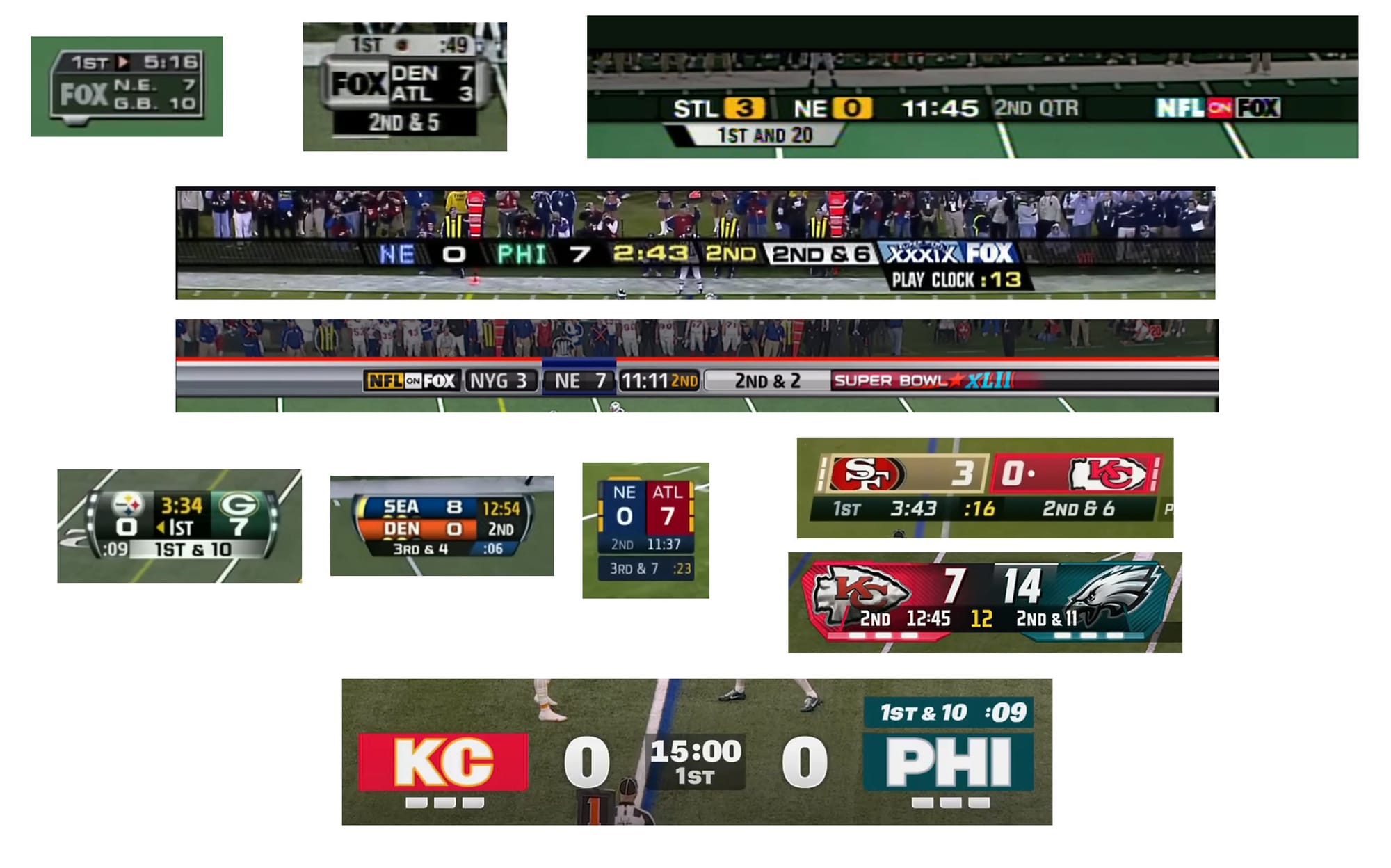
FOX only arranges football scoreboard information in a straight line or in the famous "FOX Box."
For better or worse, FOX split the difference and went with a brutally minimal hybrid.
The Good
Kerning
The kerning of the K and C as well as the P and H were well done. Great attention to a subtle detail.
Possession indicator
In keeping with the ultra-minimalist design, through most of the game there is no graphical element that only indicates the score.
Quite a difference from Super Bowl LIV, where FOX used a dot (that later evolved to the shape of a football.)
The new layout vaguely resembles NBC's graphics package, where the down-and-distance "moves" to whichever team has possession.
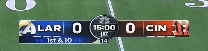
FOX took it one step further and added the play clock to the down-and-distance.
There's a problem with FOX's implementation of this philosophy, but more on that later.
Alignment
The various elements align fairly well, especially compared to CBS's disaster from Super Bowl LV.
The Bad (and the Ugly)
People complained about the "missing" team logos in the score bug, but it's not like this isn't how FOX usually does it.
Let's look at a few areas FOX could focus on to improve.
Design Philosophy
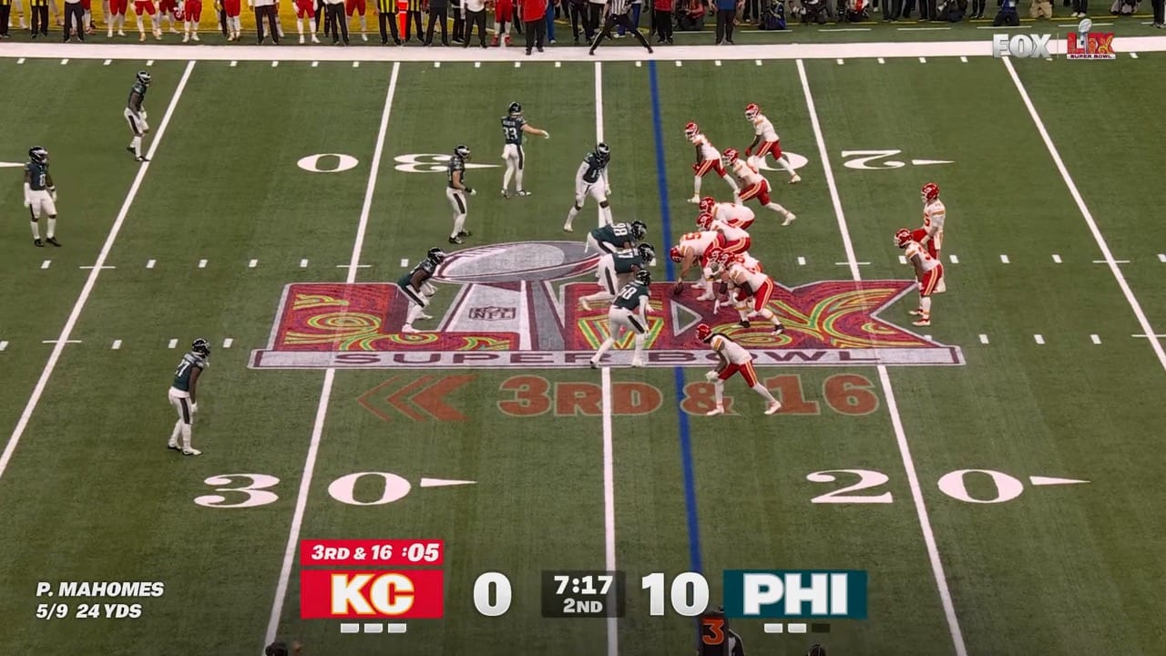
These frames are taken right after AJ Brown's touchdown.
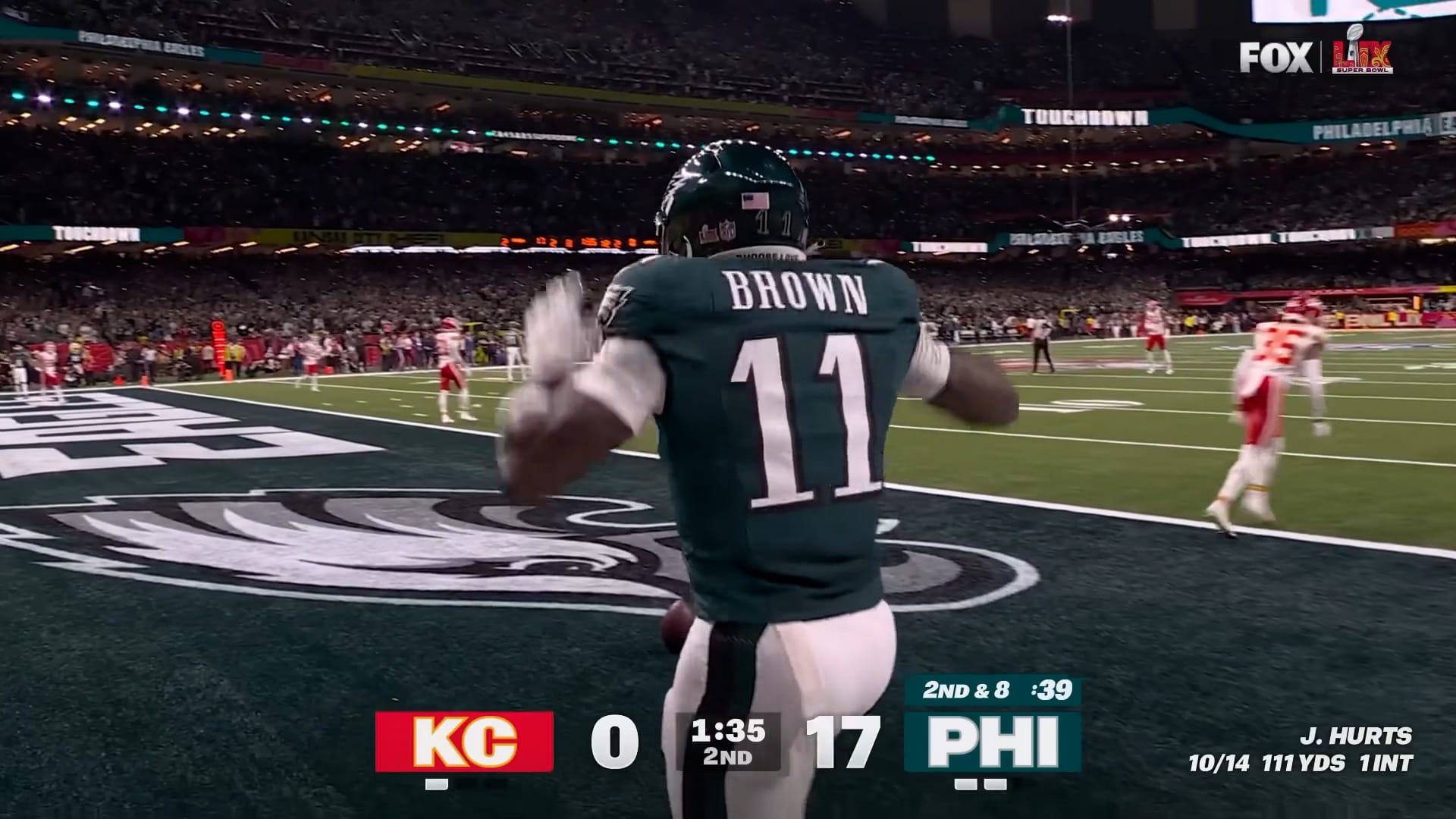
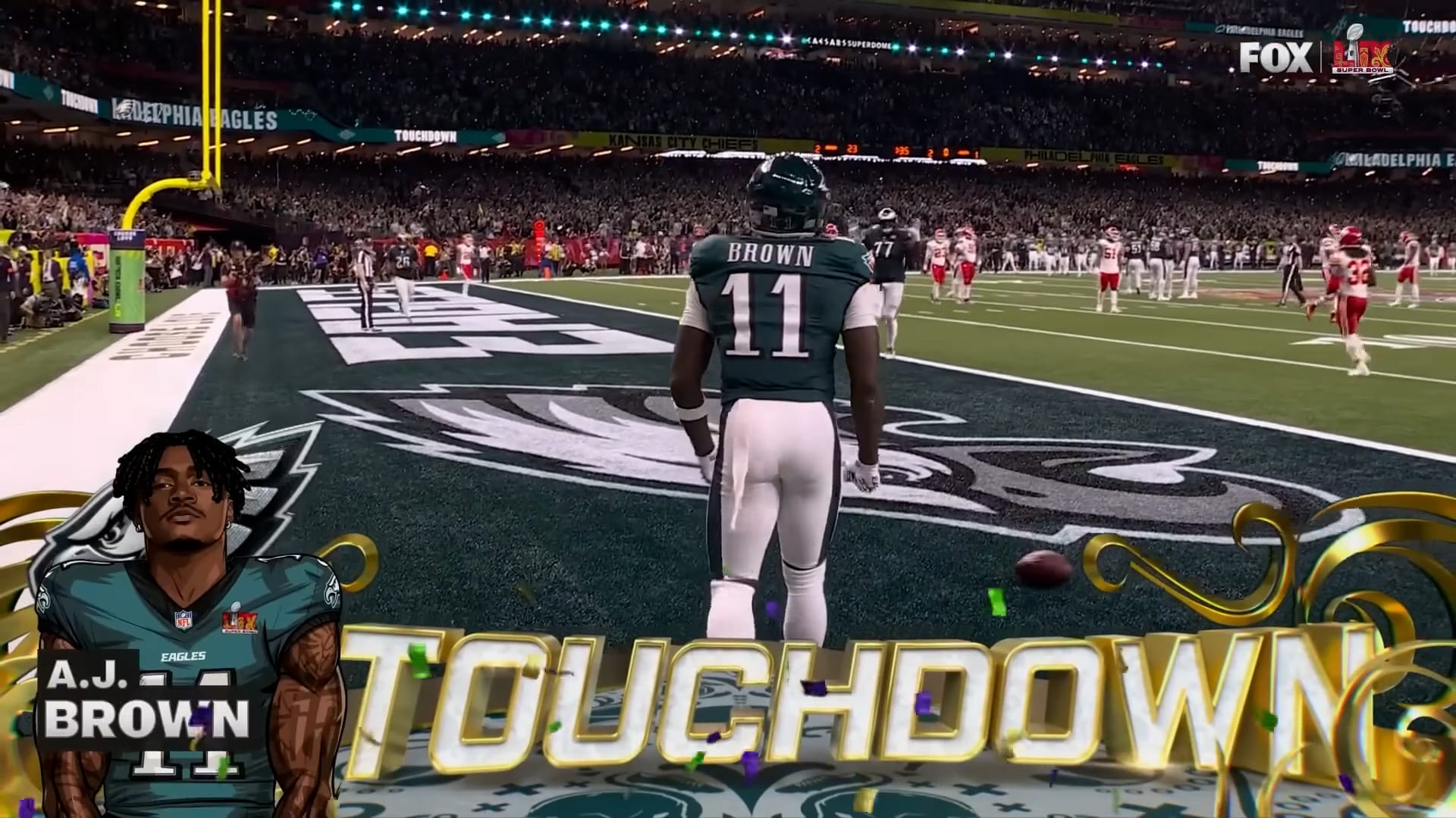
Consider the design styles of these elements:
- The score bug is ultra-minimal
- The AJ Brown graphic is a comic book-inspired design
- The word "TOUCHDOWN" is 3D and rendered in a separate environment from the game or the AJ Brown graphic
These conflicting designs don't blend together well; they create visual tension for the viewer.
Proportions
As a friend put it, "It’s simultaneously too big and too small, too basic and too cluttered."
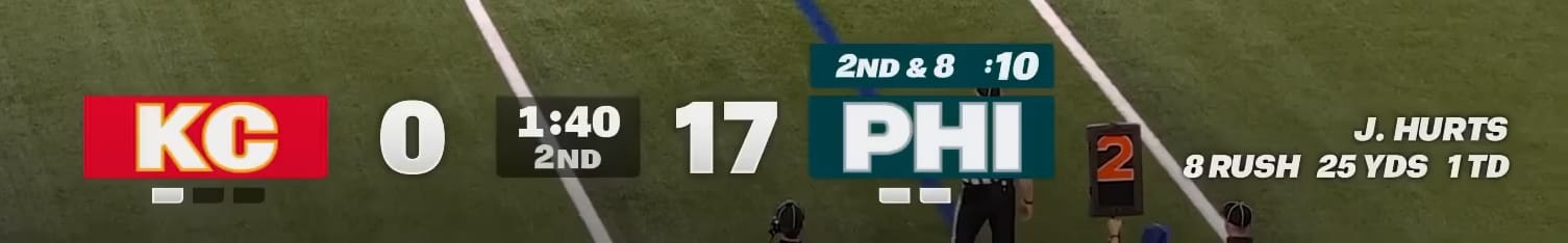
What's the philosophy behind what's italicized and what's not? Beats me. 🤷🏻♂️
And I'm curious why they made the play clock slightly larger than the down-and-distance.
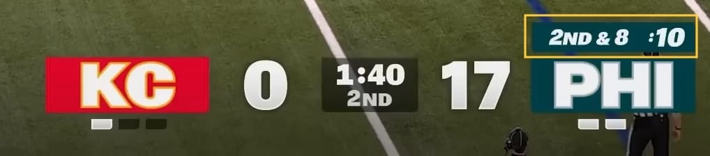
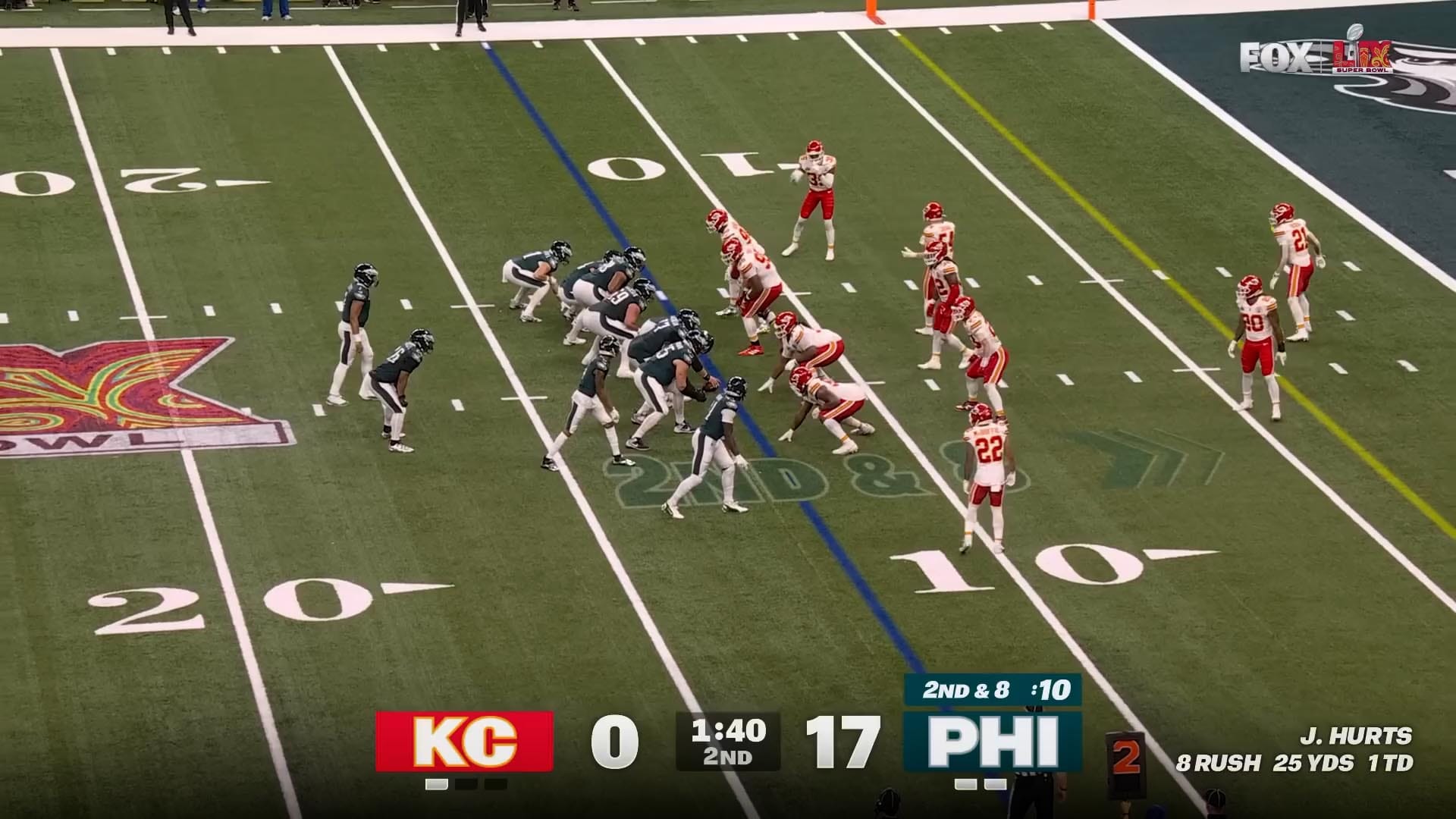
The font size for "2nd" quarter is not same as "2nd & 8"
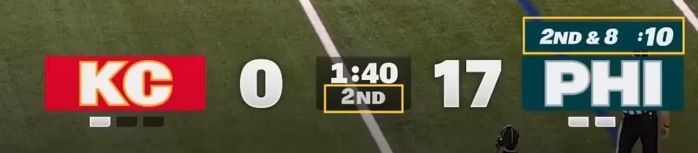
And what's going on here?
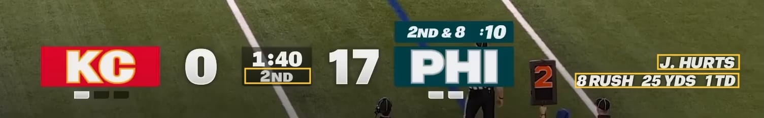
These three yellow boxes are the same height. FOX made the player name, player stats and only the quarter number the same height.
There is a subtle difference between 2nd and 2ND. FOX went with the former and chose small caps.

This creates space between "ND" and the game clock, which does not exist between the player name and player stats.
If they made everything All Caps, this subtle tension disappears.
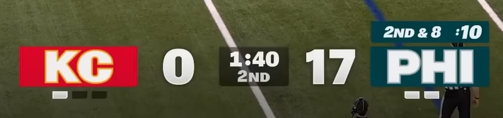
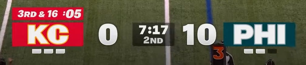
Timeouts left indicator
Look at the frame below and tell me how many timeouts each team has.

Now how about this frame?
The timeouts left indicator should be seen regardless of what color the end zone is painted.
(And it's not like we haven't learned earlier this season how important it is to know how many timeouts you have left...)

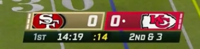
Possession indicator
When a team has the ball but doesn't have a down-and-distance, such as during a punt or two-point attempt, FOX moves the possession indicator below the team's abbreviation.

Like the timeouts left indicator, it can be very hard to read depending on what the graphic is overlaying.

(Pass) Interference
The entire point of a score bug is to....see the score.
Yet the score is constantly being interrupted by the camera.
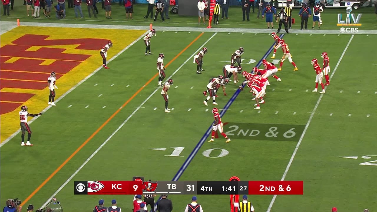
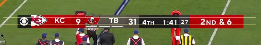
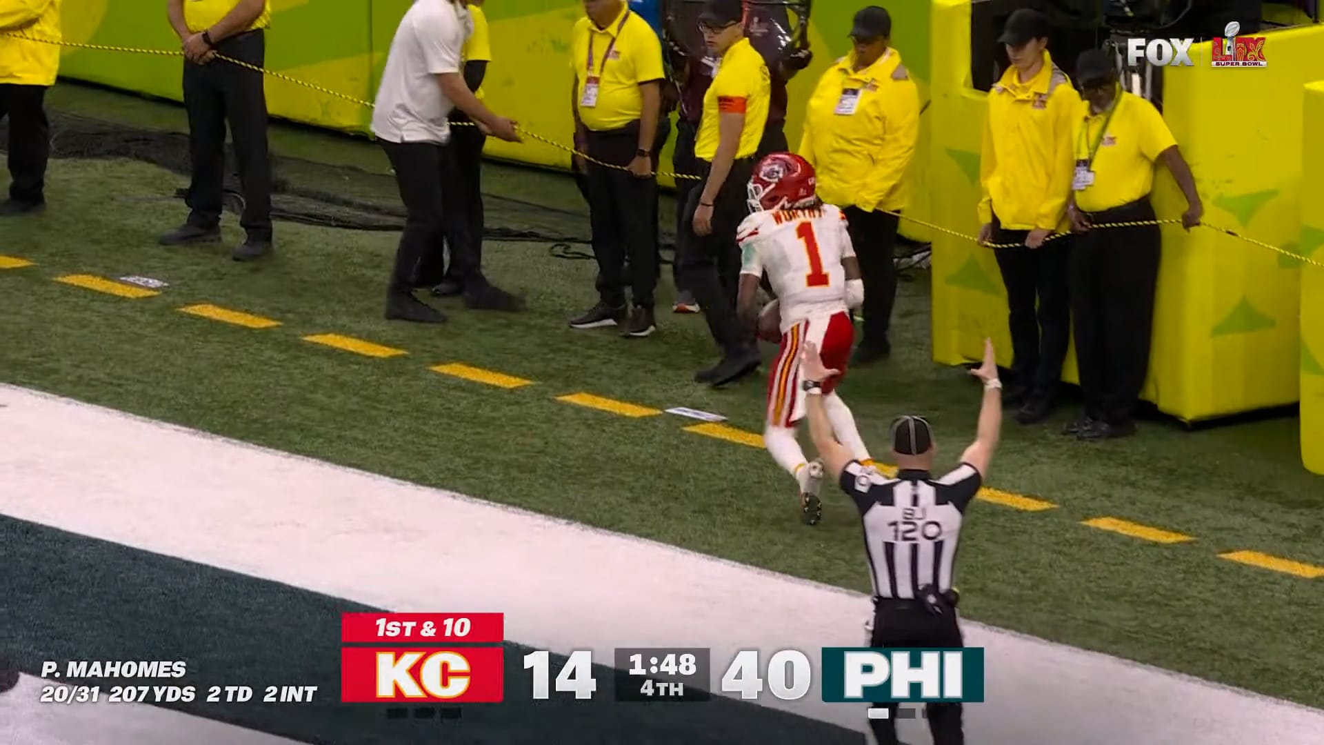
For instance, when the ball is spotted on the near hashmark, the bottom of the camera's frame will align with the chains, like this:

Look at how the down marker on the field interjects between a team's abbreviation and their score.

And here, it interjects between a team and their player's stats.

Also, the color of the chains conflict with a team's red color. Ironic given the Kansas City Chiefs were in this Super Bowl.

I'm concerned this might be especially difficult for those with color blindness, which has been a problem in past NFL broadcasts...
Here's what tonight's NFL game looks like to people with red-green colorblindness: https://t.co/xjGrDXiXI5 pic.twitter.com/2IRSKpqCGf
— Deadspin (@Deadspin) November 13, 2015
The main reason it doesn't work
The entire score bug is not anchored.
Take a look at the score bug for Super Bowl XLVI.
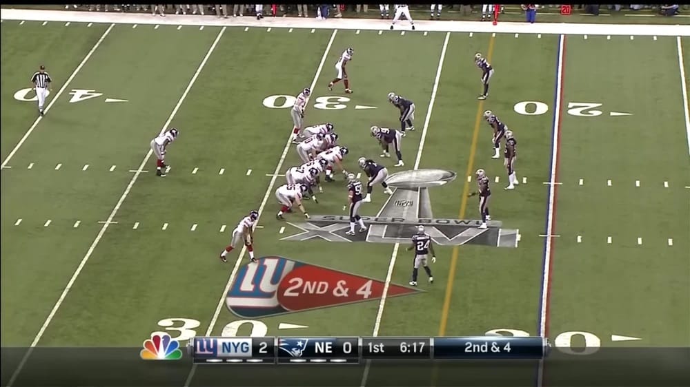
NBC added a slightly opaque, rectangular "anchor" at the bottom the screen.
This ties both the NBC logo and the score bug to the bottom of the screen.
Look at how Fox's score bug would look if they implemented the same concept.
So much better!
Final thoughts
I would have loved to see FOX's creative team balance their passion for minimalism with a structured and cohesive visual presentation.
As it is, the current iteration of the graphic package too closely resembles a high school football game and not the premier American sports broadcast.
Hopefully FOX can get this right for the fall.