Logo and Brand Assets for Nelson University Sports Network
Full rebrand for the greatest small college sports network
In the summer of 2024, Southwestern Assemblies of God University (SAGU) was renamed to Nelson University.
This change initiated a "domino effect" in logo and branding, prompting both the SAGU Athletics Department and the SAGU Sports Network to update their logos.
The Challenge
The new logo had several requirements:
- Remove all gold colors from SAGU Lions and replace it with grey
- Use the entire name "Nelson University Sports Network"
- Move away from the "shield" concept
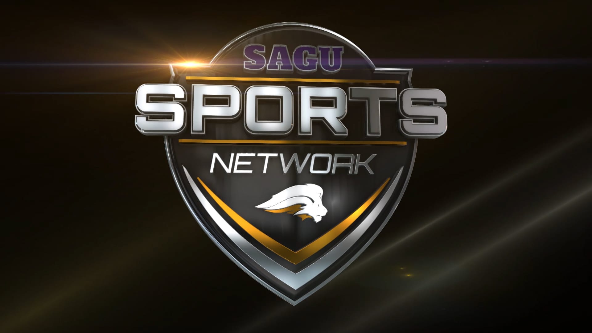
But the ultimate challenge was timing: We had 3 weeks from the finalization of the network name to our opening weekend of broadcasts to complete the entire process: concept, design, modeling, animation, and implementation.
Design Process
We were given a few images from the Athletic department of the new Nelson Athletics logo to inform the new NUSN design.
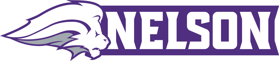
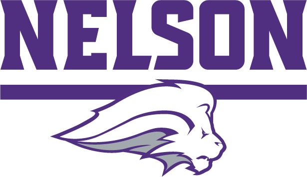
We debated creating a new logomark to differentiate NUSN from Nelson Athletics. Ultimately, including the Lion in the NUSN logo took priority over designing (yet another) new or altered mark for fans to learn and connect with.
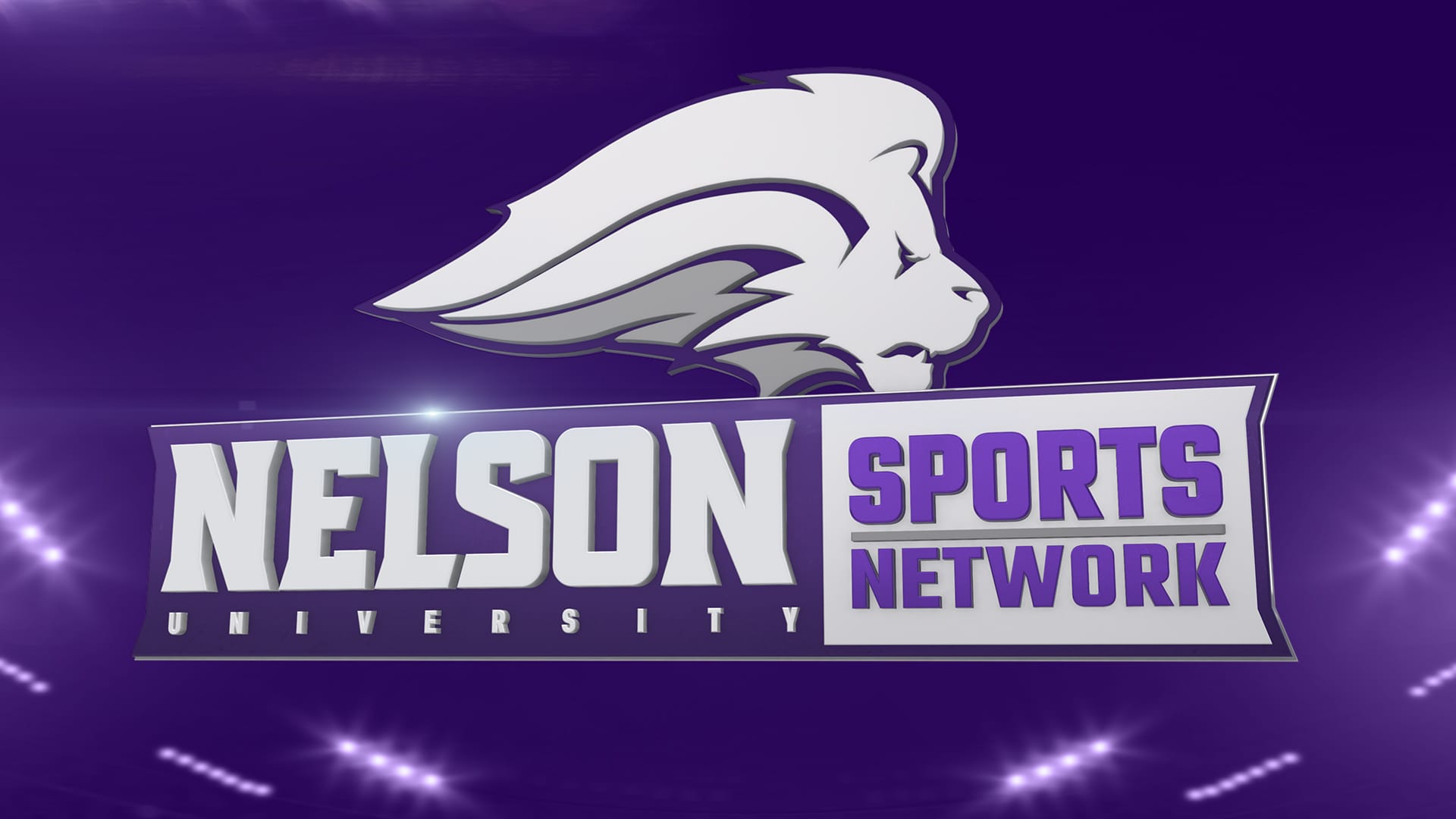
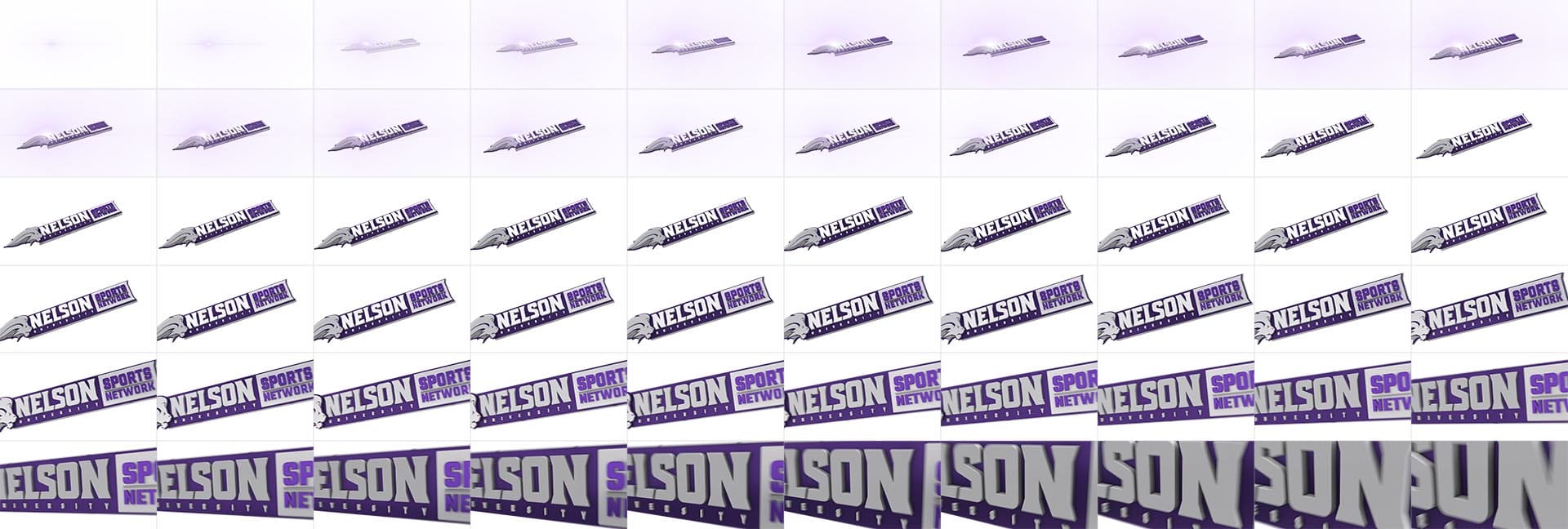
The toughest part of the process was incorporating the many letterforms of "Nelson University Sports Network" without relying on a "shield" to anchor the 32 characters together.
After exploring different concepts, we moved forward with an "expanded banner" approach, where we retained the distinct edges of the banner while extending it to accommodate the additional characters in a visually cohesive way.
Final version
2D logo
3D Logo
Replay Transition
We also used the replay transition as an opening bumper for special presentations.
Outro bumper
In-game elements
For sideline reports, we updated mic flag and redesigned the lower third to include the shape of the Nelson Athletics/NUSN banner.
I love how something as simple as the shape of a lower third so deeply ties the visual design to the NUSN brand. The difference is truly in the details.